Beginner's Guide to Technical Analysis: Charts Type
This blog is a beginner's guide to technical analysis and focuses on different types of charts used in it. It covers candlestick, Heiken Ashi, Renko , Point and Figure, and Footprint charts.
Table of Content
- Introduction
- Candlestick Charts
- Heiken Ashi Charts
- Renko Charts
- Point and Figure Charts
- Footprint Charts
- Choosing the right chart for you
- Conclusion
Introduction
You might have seen people sharing charts on Twitter, talking about Support/Resistances, Order flow, Footprint, RSI, and whatnot. In this multi-part series, Lil Goose will be going over everything related to Technical Analysis or TA. TA is a widely used method of evaluating financial assets. One of the critical components of technical analysis is charting, which involves plotting data points on a graph to visualize the asset's price and volume over time.
This beginner's guide will focus on the different types of charts used in technical analysis and how they can help you make informed investment decisions.
Several types of charts are used in technical analysis, including line charts, bar charts, and candlestick charts. Each chart provides a unique view of an asset's price and volume data and can be helpful in different market conditions. By understanding the different types of charts, traders and investors can choose the one that best suits their needs and gain valuable insights into the asset's behavior. The following sections will explore the various chart types and their strengths and weaknesses.
So, without any further ado, Let's dive right into it!
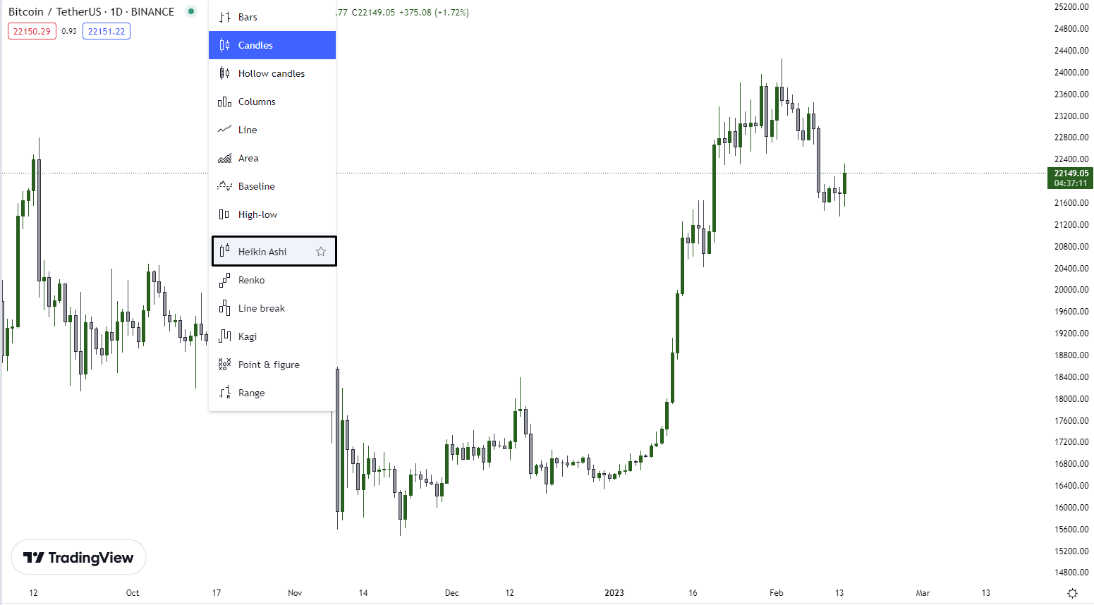
Types of Charts
We have multiple types of charts; however, for this blog, we'll be going over five different charts, which are:
- Candlestick Charts
- Heiken Ashi Charts
- Renko Charts
- Point and Figure Charts
- Footprint Charts
So let's start from the top!
Candlestick Charts
These are the most used and by far the most popular type of chart that people use. The chart is composed of individual candles that represent price movements over a set time which you could set. Each candle consists of a body representing the difference between the opening and closing price and lines representing the high and low prices for that period.
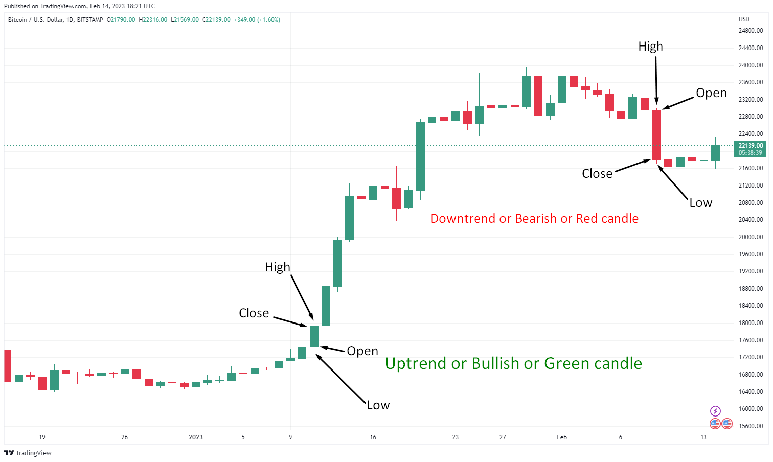
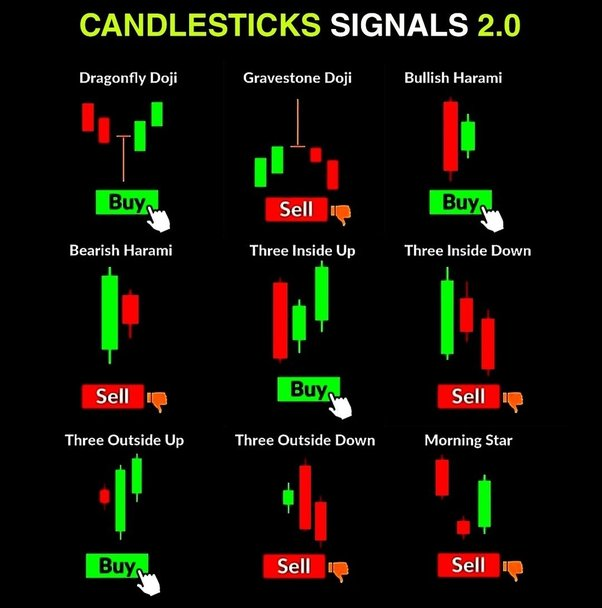
The unique feature of candlestick charts is the ability to visually distinguish between bullish and bearish market sentiment. A bullish candle has a green body formed when the closing price is higher than the opening price, indicating that buyers dominated during that period. On the other hand, a bearish candle is red and is formed when the closing price is lower than the opening price, indicating that sellers have dominated. The candlestick formed can also be used as a standalone signal of price movements. Examples of such candles are Doji candles, Engulfing candles, and many more!
In addition to being visually appealing, candlestick charts provide helpful information about market sentiment and potential price movements. For example, a pattern of consecutive bullish candles may indicate an uptrend, while a pattern of consecutive bearish candles may indicate a downtrend. Additionally, the size of the body and shadow lines can provide insight into the strength of market sentiment. A large body with long shadow lines may indicate a strong trend in one direction, while a small body with short shadow lines may indicate indecision or market volatility.

Understanding how to interpret and use candlestick charts is valuable for traders and investors looking to make informed decisions. A great tool to start understanding more about Candlestick charts and Technical Analysis would be CryptoCred.
Heiken Ashi Charts
Now that we've covered the most basic chart type let's jump into more complex chart types. First, we have another popular chart type called the Heiken Ashi chart. Heiken Ashi charts are a type of candlestick chart invented by a Japanese trader named Goichi Hosoda. The term "Heiken Ashi" translates to "average bar" in Japanese, and the chart is constructed using the average of prices over a specific period, which results in a smoother representation of price movements compared to traditional candlestick charts.
The formula used is:
- HA-Close = (Open + Close + High + Low) / 4
- HA-Open = (Previous HA-Open + Previous HA-Close) / 2
- HA-High = Max (High, HA-Open, HA-Close)
- HA-Low = Min (Low, HA-Open, HA-Close)
Unlike traditional candlestick charts, which can sometimes be volatile and provide misleading signals, Heiken Ashi charts are designed to filter out some of the noise in the market and provide a clearer picture of the underlying trend. It can be handy for traders looking to hold positions for an extended time, as it can help reduce the impact of short-term market noise.
Green candle indicates the start of an uptrend while Red candles indicate the start of a downtrend.

In addition to being useful for trend analysis, People can also use Heiken Ashi charts to identify key levels of support, resistance, and potential reversal points in the market. Despite their usefulness, it is essential to remember that every charting technique is flawed, and traders should always use Heiken Ashi charts in conjunction with other analyses to make their trading decisions.
Renko Charts
Renko charts are a type of chart used in technical analysis to track the price movement of financial assets. They were invented in Japan and are named after the Japanese word "renga," which means "bricks." Renko charts are different from traditional bar or candlestick charts as they only show price movement, ignoring the time element. Instead, they display bricks formed when the price exceeds a predefined price range or "brick size."
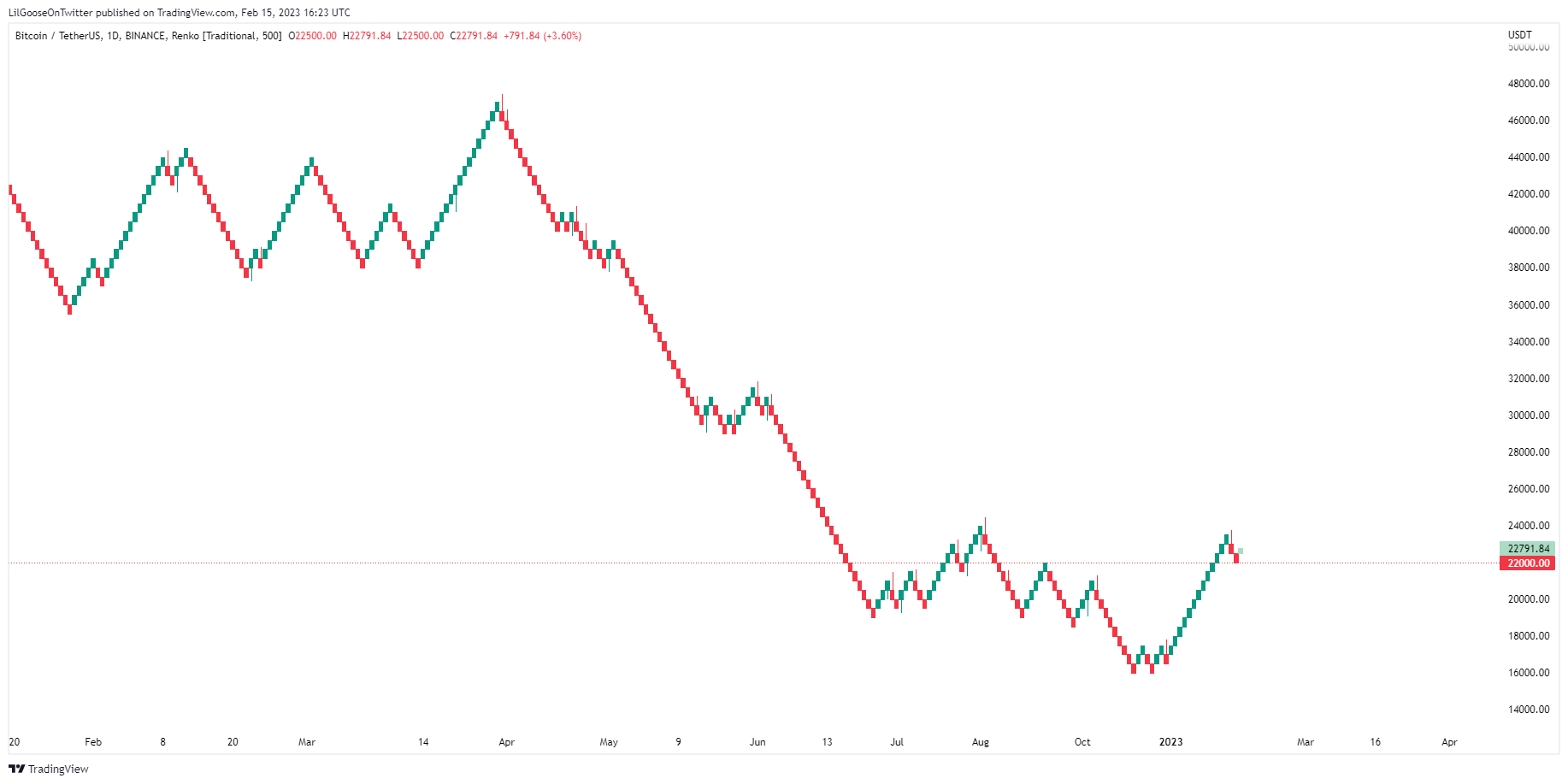
Renko charts have gained popularity due to their simplicity and clarity. Unlike traditional charts, Renko charts only show significant price movements, which makes it easier to identify trends and make decisions. The bricks are either green or red, indicating an upward or downward price movement.
TradingView only allows users to create Renko charts based on time. It means that instead of a brick forming when the price moves a certain amount, a brick will form if it closes above or below green and red Renko, respectively, during that period. For example, if we have a 500-box size Renko candle on a 5 min time frame chart on Bitcoin, the Renko will form when we have a candle close to greater than 500$ price movement.
On the other hand, tick-based Renko charts form bricks based on the number of trades that occur, making them much more helpful than your standard time-based Renko charts. While they are not suitable for all trading styles and market conditions, Renko charts can be a helpful addition to a trader's toolkit when used in conjunction with other technical analysis methods.
Point and Figure Charts
Point and figure charts are a type of technical analysis chart that traders have used for many years. Unlike other chart types that use time as a primary factor, point, and figure charts focus solely on price movement and its direction. The origin of Point and Figure charts needs to be well documented. Still, it is believed that they were developed by stock market analysts in the late 19th and early 20th centuries as a way to track price movements of stocks and other financial instruments in a more efficient and visually appealing manner than traditional bar charts.
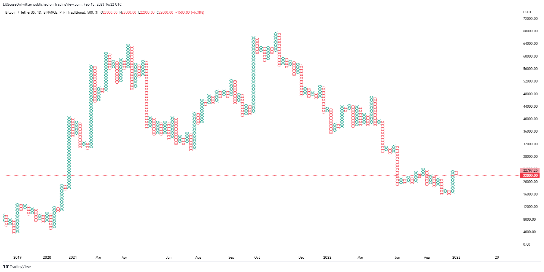
Point and Figure charts differ from other financial charts in that they don't display time on the x-axis and instead use a series of X's and O's to depict price movements. X's are used to show rising prices, while O's are used to show declining prices. The number of Xs and O's in a column depends on the price movement and the box size, which the user sets.
One of the critical advantages of Point and Figure charts is their ability to filter out market noise, making it easier for traders to identify trends and make trading decisions. The charts also provide a clear visual representation of support and resistance levels, which are critical for determining entry and exit points in the market. Overall, Point and Figure charts can be a valuable tool for novice and experienced traders, especially those interested in identifying long-term trends in the market.
Footprint Charts
Footprint charts, also known as "Volume-At-Price" charts, were developed in the early 2000s by Trevor Harnett from MarketDelta. They are a type of chart that displays price, volume, and order flow data in a way that allows traders to visualize real-time trades taking place. It can provide valuable insights into potential price movements.
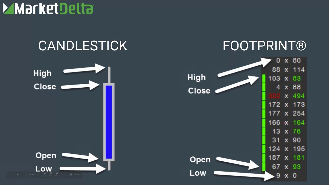
Footprint charts are different from traditional charts in that they show the volume of trades executed at each price level rather than just the volume of trades during a given time. It means that traders can see which price levels are seeing the most activity and use this information to identify potential areas of support and resistance. Footprint charts can also provide insights into the actions of specific market participants, such as large buyers or sellers, allowing traders to better understand the market dynamics.
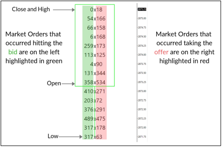
One of the critical benefits of footprint charts is their ability to display the order flow of the market. It is the sequence of buy and sell orders that makeup market activity. Footprint charts can show the aggressiveness of buyers and sellers, the timing and size of their orders, and how they interact with the bid and ask prices. By analyzing the order flow, traders can gain insight into the intentions of market participants, which can help them make more informed trading decisions.
If you want to learn more about Footprint charts, check out TradingRiot, which gives an in-depth insight into what it is.
Choosing the right chart for you
Choosing the exemplary chart to use in your technical analysis requires some consideration of several factors. One of the most important factors to consider is your trading style. Some traders prefer to make short-term trades, while others prefer long-term positions. If you're a short-term trader, you may use shorter timeframes, such as tick or minute charts, while long-term traders prefer daily, weekly, or monthly charts.
Another factor to consider is the type of asset you're trading. Different assets may exhibit different patterns, so choosing a chart type that best captures these patterns is essential. For example, if you're trading stocks, use bar charts, which display a range of prices during a given time. On the other hand, if you're trading forex, you may prefer candlestick charts, which provide a more detailed view of price movement.
It's also important to consider the market volatility you're trading in. If the market is highly volatile, use charts that help you identify and follow trends, such as moving averages or trend lines. Alternatively, if the market is less volatile, use charts that help you identify support and resistance levels, such as point and figure charts. Ultimately, the exemplary chart for you depends on your individual preferences and the specific market you're trading in.
Conclusion
Technical analysis is a widely used method of evaluating financial assets that involve charting and analyzing price and volume data over time. By understanding the different types of charts used in technical analysis, traders and investors can gain valuable insights into an asset's behavior and make informed investment decisions.
Several types of charts are used in TA, including line charts, bar charts, and candlestick charts. This beginner's guide focused on five charts: Candlestick Charts, Heiken Ashi Charts, Renko Charts, Point and Figure Charts, and Footprint Charts. Each chart type provides a unique view of an asset's price and volume data and can be helpful in different market conditions. By understanding the different types of charts, traders and investors can choose the one that best suits their needs and gain valuable insights into the asset's behavior.
Lastly, it is essential to remember that every charting technique is flawed, and traders should always use charts in conjunction with other analyses to make their trading decisions. By understanding and using different charts, traders and investors can better understand the market and make more informed investment decisions.
Stay Tuned with #GooseAcademy
Website | Twitter | Telegram | Discord | Docs
Disclaimer: The statements, proposals, and details above are informational only, and subject to change. We are in early-stage development and may need to change dates, details, or the project as a whole based on the protocol, team, legal or regulatory needs, or due to developments of Solana/Serum. Nothing above should be construed as financial, legal, or investment advice.
![Top 6 Chart Patterns for Crypto Trading [Guide]](/content/images/size/w720/2024/07/Top-trading-patterns.png)


Comments ()